top of page
Ryan Lombardi


Ninja
Building the visual foundation of a global brand. Before Ninja became a household powerhouse across every major kitchen category, it started with a single high-performance blender. As they expanded into food processing, juicing, and beyond, I helped establish the foundational look and feel of the food styling and photography guidelines that still drive the Ninja visual identity today. The imagery is aspirational but relatable, bright, fun, clean, and healthy.
Lifestyle/Product Look & Feel


Photography: Michael Piazza & Quentin Bacon
Target Shelf Graphics
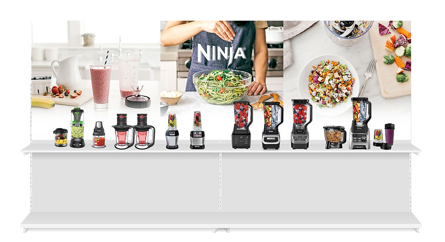

Example Creative


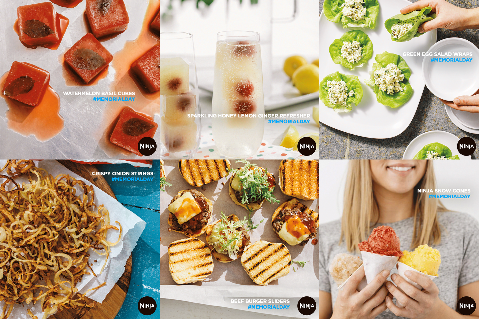


VP: Keith Manning | CD: Lauren Weirnasz | AD: Ryan Lombardi | CW: John Grillo | CW: Nini Stephanini | CW: Jad Jichi
bottom of page