top of page
Ryan Lombardi


Lawson & Weitzen, LLP
Lawson & Weitzen is a medium-size law firm in the Seaport District of Boston that offers a unique model delivering high-value, diverse legal services at competitive rates. Executive Creative Sasha Hartman was leading a complete re-brand and brought me on to develop a logo that balances traditional legal credibility with a fresh, contemporary feel that matched their service model.
Logo Design Case Study

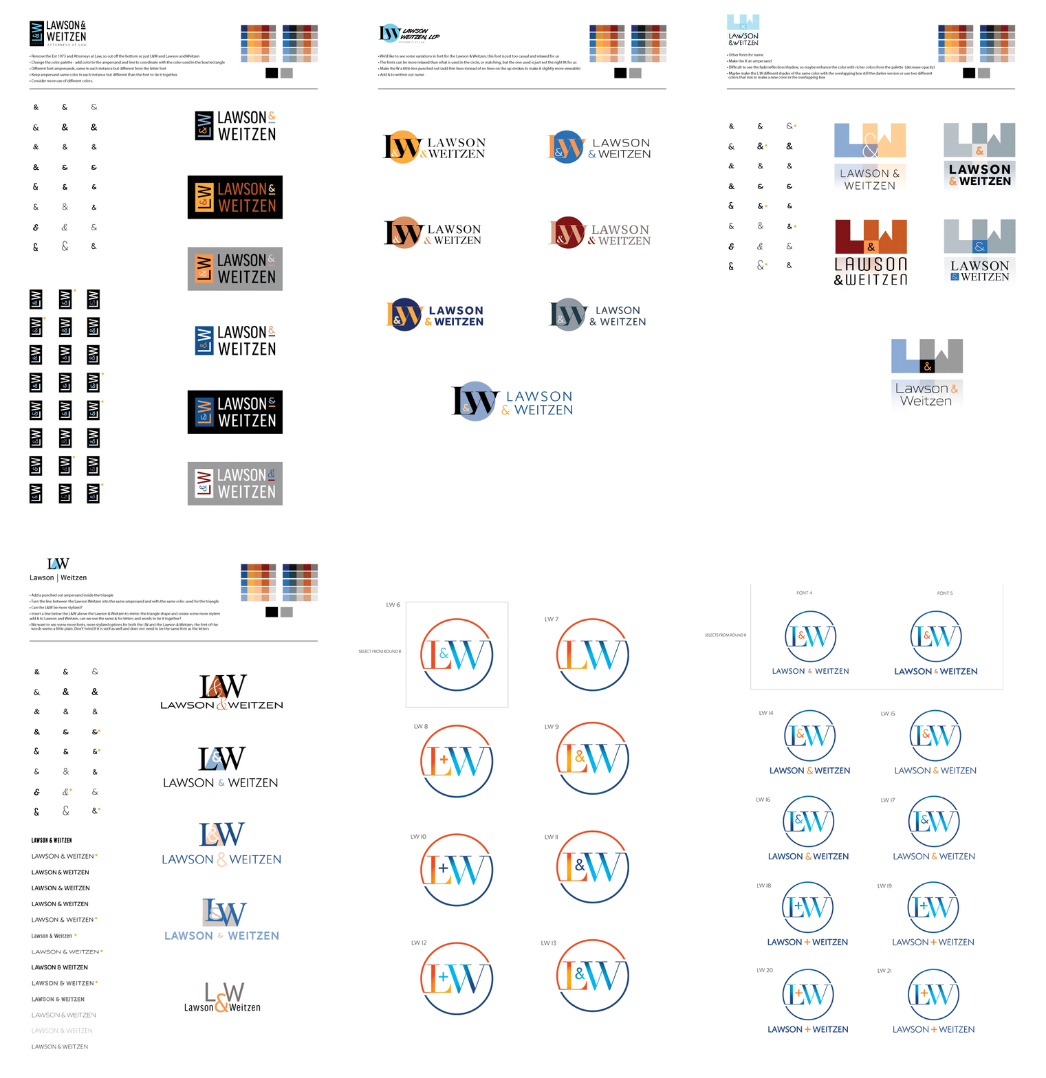
I submitted 21 new and different logo versions to get the conversation started. We went 20+ rounds of tweaking, 100's of options and iterations with font choices, ampersands, and color palettes. I'm not sure you can even imagine the amount of debate that could be had in a room full of attorneys over a logo design. I didn't object.
Identity Package:
Logo Marks, Colors, Fonts, Business Card & Letterhead Templates


bottom of page